THIRST FOR COLOR
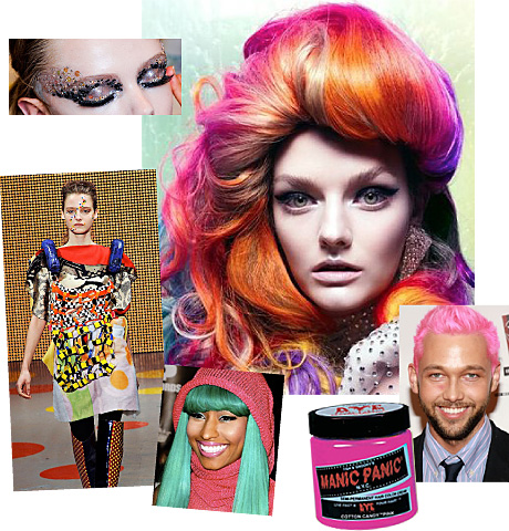
With consumers continuing to thirst for color and play, the artistic use of color is currently showing up in some more unusual places. Body art, the ultimate in creative style, has risen to new heights of personal expression. Then we have hair care where, just as with face painting, vivid shots of color are are being paired with the more neutral and hot brights shades we are seeing in apparel. (Editors’ note: our 2010 Global Fashion Award winner Chris Benz has gone pink on top.) Capitalizing on this trend, world-renowned hair stylist Paul Mitchell has created Inkworks, a range of hair color products and salon color treatments for consumers; and British-based Superdrug introduced a new range of colored hairsprays so you can get color instantly. And of course then we have the company that started it all…..Manic Panic! www.manicpanic.com/dyepage1.html
Pantone Color Team
![]()
FEATURES |
|
| • | Thirst for Color |
| • | Edible Brushing |
| • | Habit Makes Us Blind |
| • | When Food Becomes Art |
DESIGN TRENDS |
|
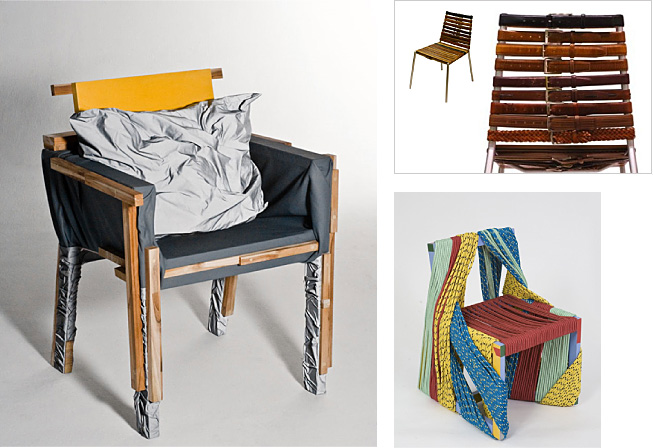
| • | A Return to Craft |
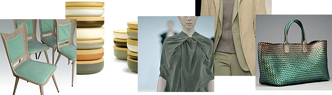
| • | Fur: From Fashion to Furniture |
| • | An Oasis of Plenty |
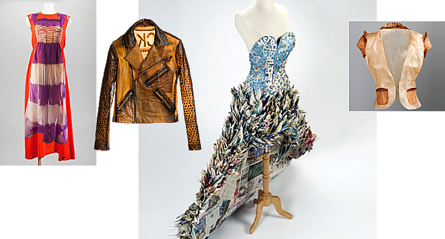
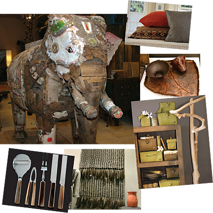
| • | Making Treasures Out of Trash |
| • | The Sway of Things to Come |
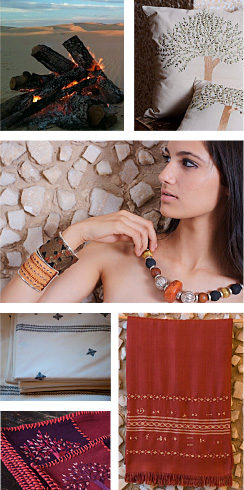
| • | Tribal Art |
COLOR FORECASTS |
|
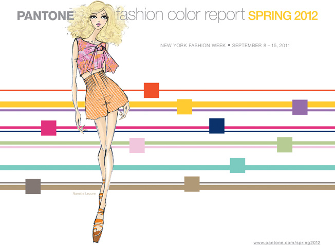
| • | Fashion Color Report for Spring 2012 |
| • | Restorative Resilience |
INTERVIEW |
|
| • | Tom Mirabile |
| • | This Issue's Contributors |
EDIBLE BRUSHING
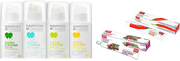
As we learn in Viewpoint, edited by David Shah, over this past decade the gourmet trend has pervaded every industry, extending from food and beverage to hair care and beauty. Now it seems that toothpaste has become the latest area to be affected by this gourmet craze. Hoping to encourage people to brush their teeth, London-based dentists Susan Tanner and Andrew Dawood have introduced toothpaste in favorite food flavors. Dawood and Tanner’s tooth cleansers (www.deliciousteeth.com) contain essential oils – as opposed to the synthetic flavors found in many toothpastes – and are available in English peppermint, Sicilian lemon, Brazilian lime and garden mint. Moscow dental company Splat (www.splat.ru) takes a similar approach and uses natural ingredients such as chili and Russian berries in hopes that caring for one’s teeth will become more enticing. In the end, “toothpaste with taste” is proof that pervasive trends can continue to grow if applied to new fields.
David Shah
view-publications.com
![]()
HABIT MAKES
US BLIND
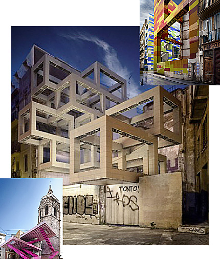
In Habit Makes Us Blind, a Valencia-based project designed by Spanish studio Espai MGR (www.espaimgr.com), installations of Lego structures are used to call attention to the vast amount of vacant space in urban neighborhoods. Demanding in their presence, these colorful displays have been created to inspire city dwellers to devise solutions that could transform these vacant lots into useful recreational spaces. Hoping to encourage passersby to look at their city with fresh eyes, the Habit Makes Us Blind project serves as a visual reminder of the importance of good design and how it can be used to provoke positive change.
Pantone Color Team
![]()
WHEN FOOD BECOMES ART
An often forgotten platform for creativity especially where color is concerned, food preparation is truly an art form, in everything from the combination of tastes to the way food is presented on the plate. According to Leatrice Eiseman (www.eisemancolorblog.com), executive director of the Pantone Color Institute, the natural design motif enjoying a big resurgence right now is mushrooms, both stylistically and color-wise. With more attention being brought to the fungi family as a result of the proliferation of mycoprotein meat substitute products derived from mushrooms, two key trends - one from the food industry and the other from the world of art – have converged.
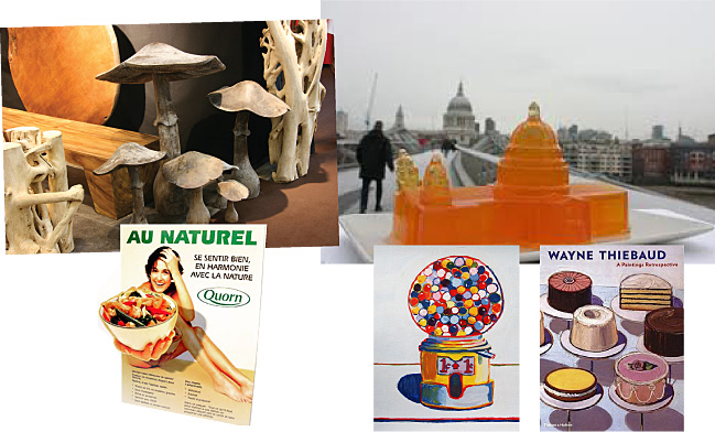
Also impacting color trends is artist Wayne Thiebaud, whose collectible Pop Art paintings of baked goods and other sweets quickly tantalize our taste buds. With culinary events becoming big business, Ms Eiseman highlights how the English team of Bompass and Parr (www.jellymongers.co.uk) has broken the mold by reinventing Jell-o® into mouthwatering works of art.
Leatrice Eiseman
Executive Director, Pantone Color Institute
www.eisemancolorblog.com
JELL-O is a registered trademark of Kraft Foods.
![]()

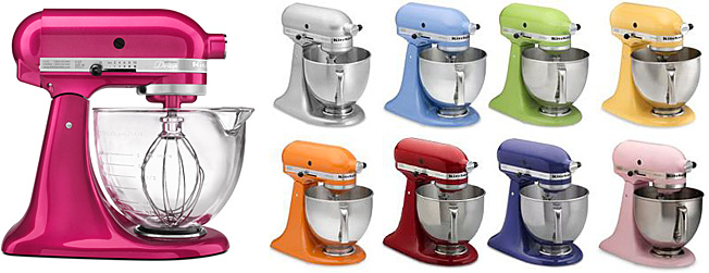
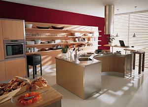
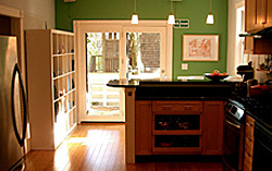
 As the kitchen takes on ever more importance as a live-work-play space,
our design and décor requirements for the kitchen are changing apace.
TONES recently spoke with Tom Mirabile, senior vice president of Global
Trend and Design at Lifetime Brands and Lifestyle Trend Forecaster for
the International Housewares Association, about designing for the new
livability of today’s kitchens.
As the kitchen takes on ever more importance as a live-work-play space,
our design and décor requirements for the kitchen are changing apace.
TONES recently spoke with Tom Mirabile, senior vice president of Global
Trend and Design at Lifetime Brands and Lifestyle Trend Forecaster for
the International Housewares Association, about designing for the new
livability of today’s kitchens.

 consumer items like appliances and countertop renovations. That said,
the American consumer has developed a much more nuanced understanding of
neutral colors and a great comfort in mixing them. If you asked
consumers 10 years ago to define neutral, they’d say “black, white,
ivory, grey, maybe brown”. Today’s consumer understands that mixing
neutrals is important to add dimension, that warm neutrals create a very
different mood and message than cool neutrals do. They know that
neutrals can be just as trend-right (or wrong) as any other color
family, and they want direction.
consumer items like appliances and countertop renovations. That said,
the American consumer has developed a much more nuanced understanding of
neutral colors and a great comfort in mixing them. If you asked
consumers 10 years ago to define neutral, they’d say “black, white,
ivory, grey, maybe brown”. Today’s consumer understands that mixing
neutrals is important to add dimension, that warm neutrals create a very
different mood and message than cool neutrals do. They know that
neutrals can be just as trend-right (or wrong) as any other color
family, and they want direction.