|
Color Attributes
There are literally millions of colors! But fortunately, they can be divided into just a few color families. And every color can be described in terms of having three main attributes: hue, saturation and brightness.
Hue is identified as the color family or color name (such as red, green, purple). Hue is directly linked to the color's wavelength.
Saturation, also called "chroma," is a measure of the purity of a color or how sharp or dull the color appears.
Brightness, also called "luminance" or "value," is the shade (darkness) or tint (lightness) of a color. Areas of an evenly colored object in direct light have higher brightness than areas in shadow.
Color Classifications
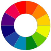
The concept of the color wheel was invented when Sir Isaac Newton bent the color spectrum into a circle. Since then, the color wheel has been used as a tool for understanding color relationships and creating harmonious color schemes. The color wheel clearly shows which colors are warm and cool, complementary, split complementary and analogous. The diagrams in the following pages demonstrate each of these concepts.
 Cool colors range from blue to violet, the half of the color wheel with shorter wavelengths. Cool colors have a calming effect. They are frequently used for backgrounds to set off smaller areas of warm colors. Used together, cool colors can look clean and crisp, implying status and calm. However, it is important to note that usage of bright cool colors generates more excitement than light, medium or dark cool colors. Cool colors range from blue to violet, the half of the color wheel with shorter wavelengths. Cool colors have a calming effect. They are frequently used for backgrounds to set off smaller areas of warm colors. Used together, cool colors can look clean and crisp, implying status and calm. However, it is important to note that usage of bright cool colors generates more excitement than light, medium or dark cool colors.
Warm colors range from red to yellow, essentially the half of the color wheel corresponding to the longer wavelengths. Warm colors are active, attention-grabbing and aggressive. They stimulate the emotions, motivate and seem to come forward off the screen or page.
Complementary colors lie opposite each other on the color wheel. They complete or enhance each other. Impressionist painters in the 19th century often placed dots of pure complementary pigment on a color's surface to make the color come alive. While the dots weren't apparent to the viewer, the color appeared especially vibrant.
When mixed together equally, subtractive complements, such as paints, should theoretically produce black or gray. In practice, the pigments are never perfect and the result is a muddy brown instead.
Using complementary colors in an image is quite pleasing to the eye. The colors seem to belong together. The most effective use of complements is to let one of them dominate by giving it a bigger area or a fuller saturation, while using the other as an accent.
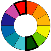 Split complements (also known as contrasting colors or triads) lie on either side of a color's complement on the color wheel. These colors offer many of the same benefits as complementary colors, but the effect is more subtle. As two of the colors will be very similar, using fully saturated colors may be too strong. Dilute the saturation by using darker shades or lighter tints to draw the colors together. Split complements (also known as contrasting colors or triads) lie on either side of a color's complement on the color wheel. These colors offer many of the same benefits as complementary colors, but the effect is more subtle. As two of the colors will be very similar, using fully saturated colors may be too strong. Dilute the saturation by using darker shades or lighter tints to draw the colors together.
Analogous color schemes use colors that are adjacent on the color wheel and so have similar hues. For example, blues, blue-greens and greens are analogous. When using analogous colors in a presentation, make one color dominant to avoid confusion and use the other colors as accents.
A monochromatic color scheme uses a single hue with variations in the saturation and brightness only. Such a color scheme produces simple images with no discord. However, if you plan to use monochromatic colors for your business graphics, make sure that you have the contrast necessary to make clear distinctions for the audience and to emphasize the important points. This is also important for achromatic graphics, which use white, black and shades of gray.
Achromatic color schemes have no color. They use black, white and shades of gray to represent colors. It may be that while your graphics will be presented in color, you'll need to produce black-and-white handouts. If so, review each handout carefully for legibility, as colors don't always translate to grayscales as expected. If a grayscaled image isn't clear enough, consider replacing blocks of color with patterns to increase legibility.
Color Harmony
In art as well as music, harmony comes from a pleasing arrangement of the parts. The science of color harmony traces its roots back to 1893 when Chevreul's "The Principles of Harmony and Contrast of Colors," was published.
The science of color harmony categorizes colors and determines harmonious groupings, such as complements, split complements, triads and analogies. Where science becomes art is in knowing how to use these colors, in what proportions and in what order.
In color and music, contrasts intensify each other. Complementary colors bring out the attributes of each other. White becomes brighter on a black background, blue enhances the warmth of orange; opposite hues are especially attention-getting. This hue contrast can cause tension in the image, if you are using fully saturated colors. Complementary colors can be brought into harmony by reducing the saturation or by mixing a little of each color with the other.
This tension is at its strongest when large areas of complementary colors touch. Leonardo di Vinci was the first to study this effect, known as simultaneous contrast. For the most part, it's visually disturbing and should be avoided. Separating large areas of complementary colors with a thin line of neutral white, gray or black will diminish the effect.
Varying the saturation or brightness of a color can cause light and dark contrasts. By simply working with complementary and analogous colors, a harmonious color scheme can easily be created. Pay attention to the saturation and brightness of the colors to prevent unexpected contrasts or to create intentional ones. If two colors are equal in saturation and proportions, the dominant color will be the one whose brightness is furthest from the background's. Similarly, if two colors have identical brightnesses, the dominant color will be the one whose saturation deviates more from that of the background.
More Color Education Articles:
|