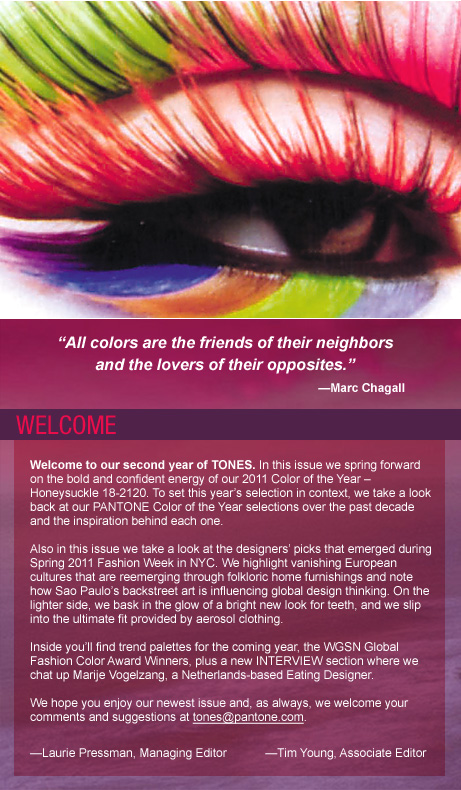
NOT YOUR GRANDMOTHER’S PINK
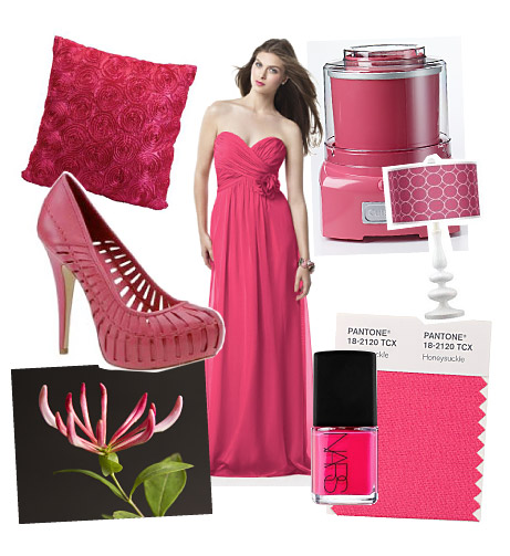
This is not the shy pink of dawn, the sleepy pink of summer lemonade, or the tidy pink of gingham curtains. This is pink with attitude. A bold, intense, don’t-ignore-me color.
Honeysuckle 18-2120, the PANTONE Color of the Year for 2011, is a confidant, assertive shade of lusciously saturated pink that fuels our desire for change and ignites our spirit, to help us meet the challenges of everyday life. It commands our attention and rewards us with a good dose of confidence and energy. Showing up just about everywhere from men’s and women’s apparel and accessories to footwear, cosmetics and furnishings for the home, Honeysuckle has become a global call for positive thinking and concerted action. Read more about the Color of the Year at http://www.pantone.com/coy2011
Have you spotted Honeysuckle lately? We invite you to send in your photos of Honeysuckle wherever you see it. We’ll publish the most interesting submissions. Send entries to tones@pantone.com with the word Honeysuckle in the subject line.

![]()
| • | Not Your Grandmother's Pink |
| • | Shades of a Decade: A look back at 10 years of PANTONE's Color of the Year |
| • | PANTONE Fashion Color Report for Fall 2011 |
| • | A Total Brand Experience |
| • | Coloring Brazil Street by Street |
| • | Spray-On Fabrican - Where Fashion Meets Technology |
| • | Lighting Up Your Smile with LEDs |
| • | Pantone Recognizes WGSN Global Fashion Color Award Winners: Chris Benz, Top Shop, Uniqlo |
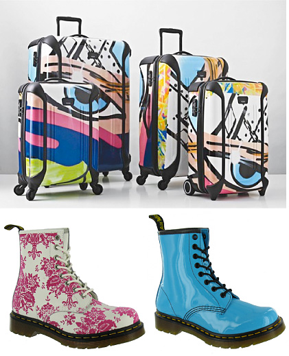
| • | Trends: Is Bold Color the New Black? |
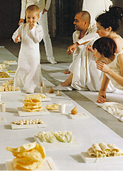
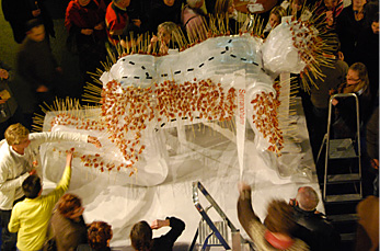
| • | Gypsy Heritage |
| • | Masstige Market Continues to Gain Appeal |
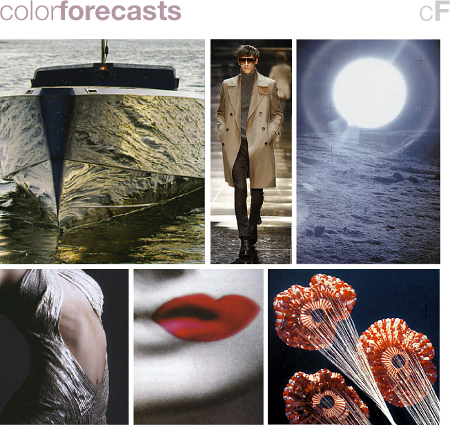
| • | Lunar: A Palette For All Time |
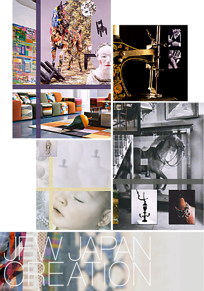
| • | Japan Creation Outlook - Autumn/Winter 2011 |
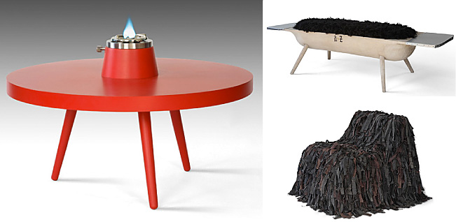
| • | Focal Points: Creating That Palpable Presence In the Home |
| Interview: Marije Vogelzang | |
This Issue's Contributors |
|
Honeysuckle
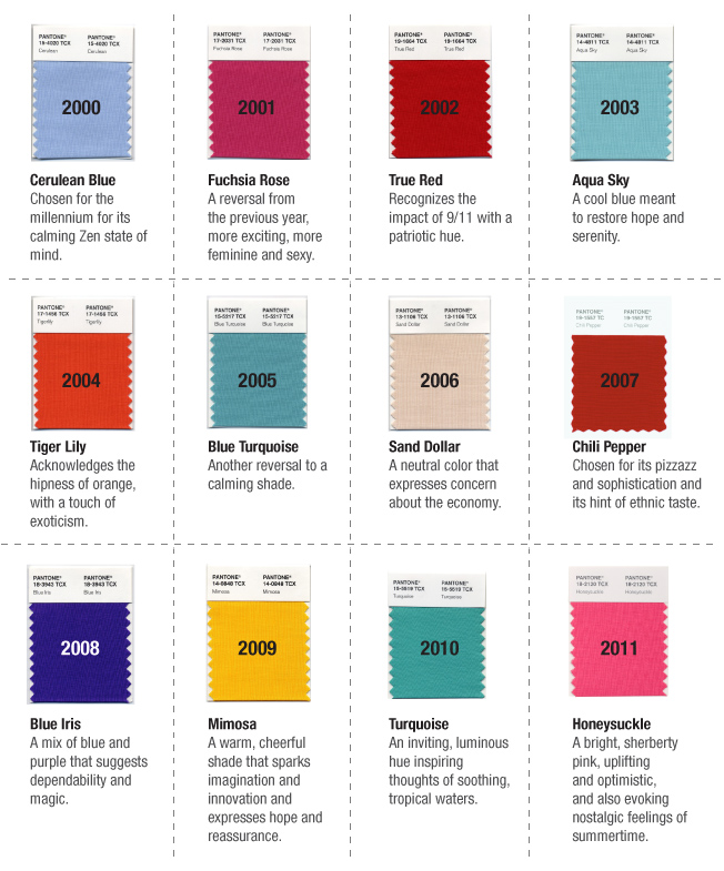
SHADES OF A DECADE:
A LOOK BACK AT 10 YEARS OF PANTONE’S COLOR OF THE YEAR
Each year, Pantone surveys the cultural color landscape and pinpoints an emblematic color that both reflects the zeitgeist and portends the central, imminent color trend across every industry where color is crucial to success.
To decide on the Color of the Year, Pantone color experts confer with a broad cross section of designers from around the world who are involved in fashion, home furnishings and industrial and print design to find out the colors they think will be important in their businesses for the coming year. This input is sifted to find the color family that is fresh and new, as well as common to many different industries. From there, Pantone narrows the palette down to a specific shade within that color family that is consumer friendly and can be used to sell all types of products and packages.
In making its annual color selection, Pantone also considers cultural factors such as social issues, the economy, technology, lifestyles and play styles, diversions, entertainments and the needs, moods, fantasies and aspirations of consumers.
Here is a look back at the first millennial decade as seen through the PANTONE Color of the Year prism:
![]()
PANTONE FASHION COLOR REPORT FOR FALL 2011
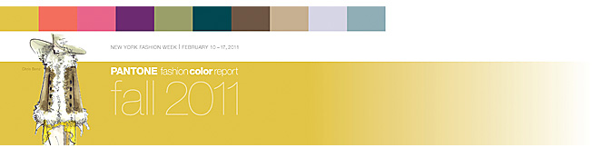
PANTONE’S Fashion Color Report provides a first look at the season’s top fashion color picks from the industry’s leading designers. The stabilizing yet sometimes surprising palette evokes the rich and complex notes of autumn, from the comfort of a glowing fire to the sweet mystery of a deepening fall sunset. “Designers take a painterly approach to fall 2011 by artfully combining bright colors with stable neutrals, reminiscent of how an artist would construct a stunning work of art,” said Leatrice Eiseman, executive director of the Pantone Color Institute. “Much like a painter’s masterpiece, there is a certain romance to this season’s palette.”
![]()
Follow this link to read – and savor – the PANTONE Fashion Color Report for 2011.
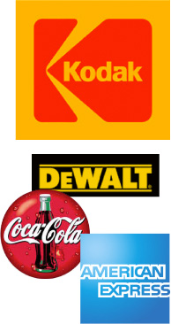
A TOTAL BRAND EXPERIENCEAs Leatrice Eiseman (www.eisemancolorblog.com), executive director of the Pantone Color Institute, explains in her book Color Messages and Meanings, “While it is a given that a successful brand logo is a happy marriage of shapes, symbols and colors, it is truly the colors that evoke the emotional message.” Many leading brands are so linked to specific hues that they are primarily recognized by their color or colors. Think Coke red, American Express blue, Kodak yellow and red, and DeWalt black and yellow. When a color and design “signature” is established it becomes the brand identifier that reinforces the image in the marketplace across many levels of communication. This should include print and collateral materials, Websites, packaging, point-of-purchase displays, signage, as well as the product itself, creating what is termed a “total brand experience”. Consumers need to have that brand experience whenever they shop or seek information about a brand, as it reinforces the image and helps to establish that they will receive the same quality and service across many platforms. Leatrice Eiseman, Executive Director, Pantone Color Institute |
 |
COLORING BRAZIL STREET BY STREET
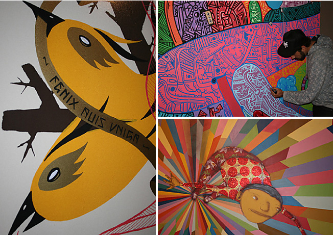
The world of art has a major influence on trends and when it comes to street art, Sao Paulo, Brazil has grown to become a globally influential hive of creativity. From Andre Farkas to Rui Amaral and Mazu Prozac, the graffiti scene in Brazil is really heating up. Most recently we saw TRANSFER, (http://transfer.art.br/), an exhibition showcasing visual art, street art, skateboarding, independent music, as well as underground comics and fanzine art taking center stage. Featured here were original artwork and site-specific installations from internationally acclaimed Brazilian and American artists with roots in urban culture. Highlighted were the history and complexity of these interrelated creative cultures between both nations that are now merging with the mainstream art world on an international scale. Influenced by the underground subculture as well as their Brazilian roots and traditional folk motifs, the dazzling color palettes created were a beautiful sight to behold.
![]()
Pantone Color Team
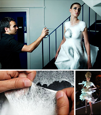
SPRAY-ON FABRICAN – WHERE FASHION MEETS TECHNOLOGY
|
Over the years we have seen many unexpected things released from a spray can, including cheese, insulation, cosmetics and hair. Well, now we can add clothing to this list. More than 10 years in the making, Fabrican, (www.fabricanltd.com), the world’s first fabric in a can, is an aerosolized liquid sprayed directly onto the body in order to create wearable garments. Working with particle technologist Paul Luckham, trained fabric designer and Fabrican inventor Manuel Torres developed a formulation of suspended fibers, binders and polymers that when combined together create a strong non-woven material. Fabrican sprays on cold, but the layers of fiber quickly dry and bond together, forming into a snug-fitting garment that feels like a rubbery suede. While there are many other industries where the flexible adhesive properties of this technology could easily be applied, we must first wait and see if this new approach to the application of fabrics has the stickiness to survive.
Pantone Color Team |
|
![]()
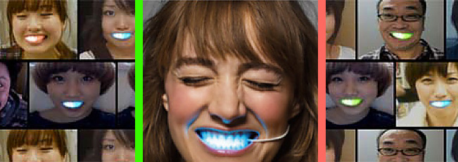
LIGHTING UP YOUR SMILE WITH LEDS
There was a time when gold front teeth or those embedded with expensive jewels were all the rage. Now, Japanese schoolgirls are behind a new era of fashionable accessories for their front teeth. These new “fronts” contain bright multicolored glowing LED lights and, though originally created as an experiment by two Japanese designers for a commercial advertising a winter sale at Japanese clothing store, Laforet Harajuku, (www.laforet.ne.jp), they are quickly becoming a sought-after accessory, Changing colors wirelessly through a computer interface, the LED smiles can easily be affixed to your teeth and glow different colors while you smile. Though they certainly light up your smile during the day, they truly are a sight to be seen when viewed in the dark.
Pantone Color Team
![]()
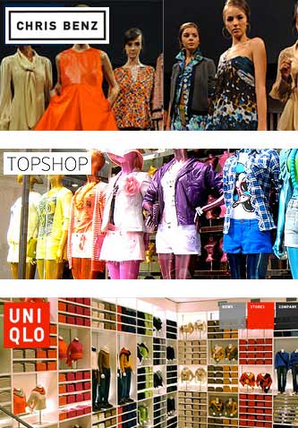
PANTONE RECOGNIZES WGSN GLOBAL FASHION COLOR AWARD WINNERS: CHRIS BENZ, TOP SHOP, UNIQLO
|
If design is the voice of our culture, then colors are the words it speaks.
With color playing an integral role in the world of design, it is important to recognize those individual designers or retail companies that are noteworthy for their unique and expressive use of color in the collections they create, and use color to best communicate our moods, our desires, and our hopes. Launching his first collection at NY Fashion Week in February 2007, designer Chris Benz (www.chris-benz.com) is someone who has repeatedly displayed a love of color and pattern and continues to inspire us by showing an array of unusual, unexpected and striking color combinations within his collections season after season. International retailers Top Shop (www.topshop.com) and Uniqlo (www.uniqlo.com) are both unique companies that in recent years have been consistently engaging and daring their shoppers with bold color and style, capturing the world's imagination by partnering with iconic models and artists to create capsule collections that are vibrant, vivid and full of character. Pantone Color Team |
![]()