  |
METALLIC GLIMMER
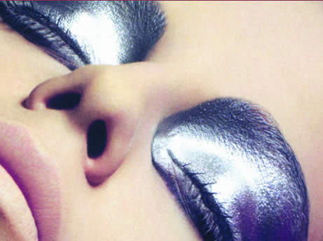
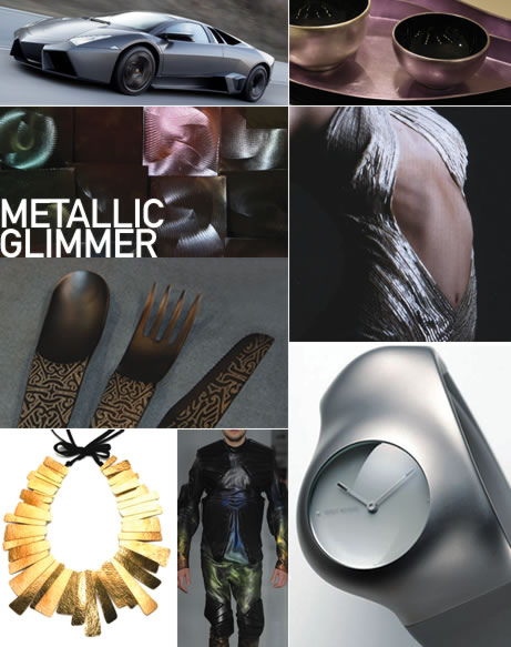
Seen all over the runway and at key home furnishings trade shows this past season, metallics speak to our desire to have some luxury and glamour in our lives. The wide variety of gold metallic shades we have seen in the past is still out there; however, as we move forward to 2011 we are seeing consumers turning away from excessive glitz and "bling" and instead moving toward metallic finishes and treatments that appear warmer. Artful patterning, mottled finishes and distressed or etching techniques are some of the new surface treatments being applied to the standard gold, silver and bronze metallic shades, as well as to color. The ongoing interest in combining different metallic shades is a trend we also see continuing for 2011.
—Leatrice Eiseman, Executive Director Pantone Color Institute
eisemancolorblog.com
| Have you spotted unusual metallic colors or finishes lately? Send in your photos and we'll publish the most interesting submissions. Address entries to Tones@pantone.com with the word Metallics in the subject line. |

![]()
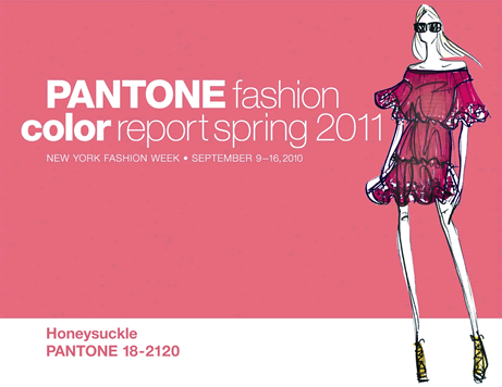
Citing exotic destinations like Africa, India, Peru and Turkey as inspiration for spring 2011, designers continue to satisfy consumers' need to escape everyday challenges with intriguing color combinations that transport them to foreign lands.
"The colors designers have chosen for the spring season present an interesting marriage of unexpected warm and cool tones," said Leatrice Eiseman, executive director of the Pantone Color Institute®. "By cleverly combining complementary colors, those that are opposites on the color wheel, they have created a striking intensity in the palette. These unique color combinations make it possible for consumers to pair existing pieces in colors traditionally associated with fall, with new favorites to punch up springtime wardrobes."
View the full report: pantone.com/spring2011
![]()
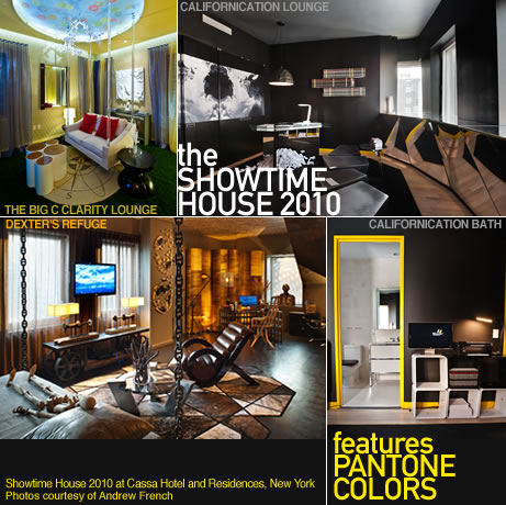
THE SHOWTIME HOUSE 2010 FEATURES PANTONE COLORS
PANTONE PAINTS by Fine Paints of Europe, Pantone's luxury line of designer paint, was selected by Showtime Networks as a showhouse sponsor for the fourteen spectacular environments that comprised this year's SHOWTIME HOUSE 2010 located at Cassa Hotel and Residences in New York City. Each distinctive room was inspired by a Showtime original series and featured a palette of PANTONE Colors chosen by some of today's most imaginative interior and architectural designers. Dexter, The Borgias, Nurse Jackie, The Big C, The United States of Tara, Californication and Weeds were all represented in settings that blended evocative color combinations with striking furnishings and objets d'art, in surprising and often vertiginous spaces. For an online tour, go to showtimehouse.com.
![]()
| • | Metallic Glimmer |
| • | PANTONE fashion color report spring 2011 |
| • | The Showtime House 2010 features PANTONE Colors |
| • | Collaborative Branding and the "You Design Movement" |
| • | How Strong Branding has Translated into the Timelessness of Tiffany |
| • | Urban Fields |
| • | Coloring the Stores of the Future |
| • | Contemplation |
| • | Trends: Product + Packaging: Design's Golden Age |
| • | Flights of Imagination |
| • | The Magic of Alpine for Autumn 2012 |
| • | The Delicate Dreamscape of Momentary |
| • | Spring / Summer 2012 Activewear: The Age of Collective Creation |
| • | Classy Overtones for the Home in 2011 |
| This Issue's Contributors | |
 |
Beaujolias
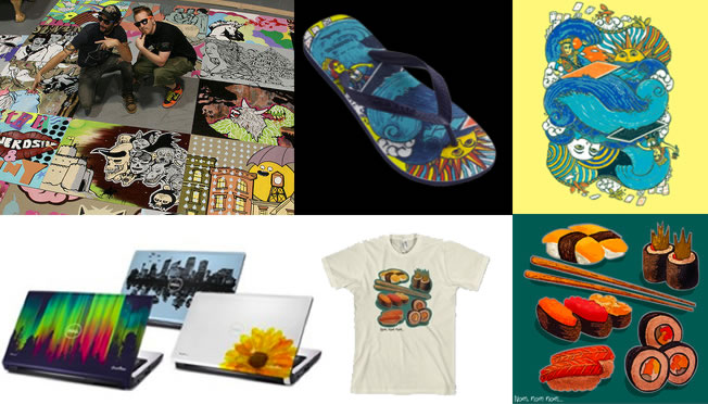 |
| COLLABORATIVE BRANDING AND THE "YOU DESIGN MOVEMENT" In the Summer 2010 issue of Viewpoint, publisher and owner of View Publications David Shah talks about the "you design movement", a concept whereby the public is not only invited to design its own garments and products, but also have them mass produced. He cites Chicago-based firm Threadless (threadless.com) as one of the earliest crowd-sourced labels, mentioning how they began what is now a much copied online T-shirt contest in 2000 with only $500. Today, a mere 10 years later, their annual volume is many times that and the company has a global talent pool and focus group community of more than 1.2 million. Members vote regularly on their favorite designs and the most popular ones are then sold on the threadless.com site. More recently, Threadless has hooked up with Dell to provide an exclusive collection of artist renderings for laptops, which will be sold through the Dell Design Studio, and with "flip-flop" leader Havaianas (us.havaianas.com/threadless) to create the world's first crowd-sourced flip flops. view-publications.com |
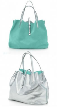 |
HOW STRONG BRANDING HAS TRANSLATED INTO THE TIMELESSNESS OF TIFFANY Whether or not you have ever entered a Tiffany store or purchased one of their products, you know that this 200-year-old brand is synonymous with the highest level of quality, service and reliability. The Tiffany consumer is brand loyal and proud to proclaim the Tiffany name when asked where a product was purchased. During the early 1900's Tiffany's president, Walter Hoving, took his sharp instinct for marketing and used color as his design strategy to create customer loyalty, designating a shade of robin's egg blue as the color Tiffany would use for all of their product packaging. Hoving knew that color was key to brand identity because of its ability to evoke immediate, strong physiological and psychological bonds. Today the Tiffany blue box is a globally recognized iconic symbol that announces to the world something wonderful is inside. On September 1, Tiffany's introduced a handbag collection. Challenged to come up with a feature that would make these bags desirable and recognizable, designers Richard Lambertson and John Truex immediately turned to – what else? – that signature robin's egg blue that has come to stand for a brand whose designs are known to be timeless, classic and luxurious. tiffany.com |
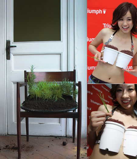
| URBAN FIELDS Urban Field, a trend palette from PANTONEVIEW Colour Planner F2010/2011, talks about why nature is our best master and explains the importance of observing and respecting its wisdom, and aligning ourselves with the natural movement of things. Whether buying our food from Farmers Markets because of its freshness, creating interior gardens in our homes, decorating our furniture with flora or designing garments containing foliage, we idealize plant life and open our surroundings to nature's vital greens as it reminds us of simpler pleasures and offers a respite from city life. In Japan, where concerns over food safety and the environment are attracting more urbanites to agriculture, leading lingerie manufacturer Triumph International Japan (triumph.com/jp) has designed a Grow-Your-Own Rice Bra that can be turned into rice planters. Created in hopes that more people will become familiar with farming and develop awareness of the importance of agriculture, the bra, made out of recyclable plastic, can be transformed into a rice growing kit, allowing the wearer to cultivate rice anytime, anywhere. The lingerie set includes removable pads in the cups that turn into sun-blocking arm covers, a hose that doubles as a belt, rice seeds and a bag of soil. What more do you need? |
 |
|
pantone.com/vcpf2010
|
||
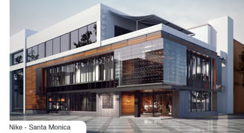
| COLORING THE STORES OF THE FUTURE |
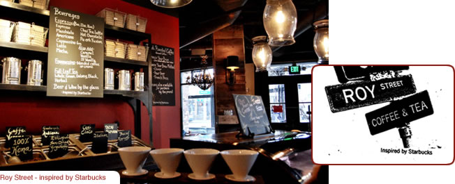 |
| Over the last ten years, with globalization taking hold, many retail companies created their brand environment and quickly transplanted and standardized this same design around the world.
With consumers today looking for a more personalized experience, now many of these same retailers are adapting to the seismic shift in consumer attitudes by creating unique and exciting retail settings that offer greater local consumer appeal. Understanding that a product or shopping environment must touch and stimulate the customer's senses and the significant role color plays in creating this excitement or visual drama, retailers like Nike (nike.com) are opening prototype stores where the architectural style takes on more of the local flavor and the product offering is more comprehensive and/or customized for the local population. To differentiate their store environments, coffee company Starbucks (starbucks.com) is developing different styles, color palettes and environmentally sustainable construction methods for greater adaptability to different settings. |
 Facing fierce market competition and a new, more demanding consumer, can the retail community react quickly enough to create the differentiated brand and store experience this new consumer desires?
 |
| CONTEMPLATION Contemplating the nature of our world is serious business. Blending the best of the past with the issues most essential to the future of humankind is a challenge daunting even to the deepest thinkers among us. But we continue to try to solve the problem of what it is to be human. The shades we use to express this contemplative mood evoke feelings that are suitably ethereal and poetic. Oxford Tan, Mustang, Sable and Chocolate Brown bring to mind the colors of old books and manuscripts. White Sand, Moss Gray and Dove recall contemporary ideas like recycling and abstraction. References to rare and even extinct species, through faded tones of Burnished Lilac and Twilight Mauve, suggest textures and colors that are at once real and unreal. An occasional gleam of Champagne Beige speaks to an interest in the best of the past – as well as the duty to reuse and reinvent in order to address the needs of the future. —Keith Recker, PANTONE Color Studio |
|
TRENDS: PRODUCT + PACKAGING: DESIGN'S GOLDEN AGE I believe we're currently living in a golden age of design. Never before has design played such an important role — and one that is so appreciated and expected by consumers. Today's consumer favors elegance, intuitiveness and sheer beauty in products, and exceptional packaging, communications and experiential retail environments. There's no longer a distinct 'line' between creatives and marketers, and even less so now with consumers. With social media and personalization, consumers are designing or helping to design exactly what they want, when they want it. The value of consumer-led design has made brands like Apple mainstream, with qualities deeply rooted in and understood by mass audiences. Cheer Pack North America's focus on their customers' desire for sustainability, beauty and innovation led to a great new design that's not only functional – these stand-up pouches are lighter, easier to ship, more sustainable, unbreakable and help deliver a better product to people – but also allows for exceptional printing quality and increased room for branding and communication. It's a great time to be a designer. —Martha Seidner, Vice President, Smith Design smithdesign.com |
|
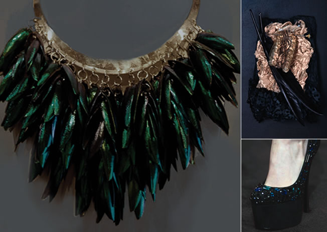 |
| FLIGHTS OF IMAGINATION With Accessories giving consumers the ability to create individual conformity at affordable pricing, we are seeing a renewed sense of interest in this decorative category. In Family Ties, a color palette found in Wonder, the PANTONEVIEW Colour Planner forecast for Fall/Winter 2011/2012, we find our inspiration in the world of dressed darkness and see how opulent fabrications and intricate feather combinations are enhanced by their application of color. Whether it is the mixing of these deep and inky tones with antiqued and burnished highlights or the flickering iridescence resulting from the sheen in the spotlighted materials, Family Ties is a palette that understands our pleasure of darkness and our need for rediscovery and dressing up. Find out more at pantone.com/vcpfw11 |
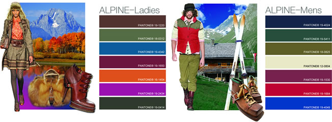 |
| THE MAGIC OF ALPINE FOR AUTUMN 2012 The contemporary fashion crowd will take to the hills in 2011 with Alpine. In the Autumn 2012 color cards created for the US-based MAGIC trade show, Fashion Snoops shows us how, for women, Alpine transports us to the Tyrolean mountains, where the hills are alive and the cool winds cascade across snow-dotted peaks. Here we see antiqued burnished leather, autumnal berries and oranges hinting at the changing leaves of the maple trees' foliage, while pops of peony and peacock blue conjure up images of folkloric handicraft breathing a bohemian flare to this expression. The swoosh of wood blades against freshly packed snow is the driving force in the Alpine expression for men. Brick red, off white and athletic blue are reminiscent of vintage sport – with the Tyrolean mountains playing as a backdrop highlighted by the deep spruce green of the hilltop and the de-saturated moss blanketing the forest. Fashionsnoops.com |
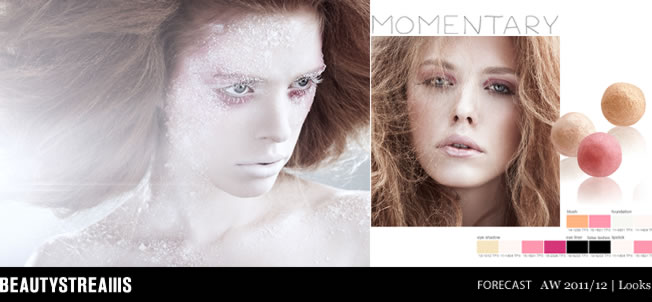 |
| THE DELICATE DREAMSCAPE OF MOMENTARY According to new online beauty trend forecaster Beautystreams.com, one of the key color palettes for Autumn/Winter 2011/2012 is called Momentary, a group of brisk tints enshrouded by the gossamer lightness of arctic whites. Dreamscape, one of the key looks in Momentary, shows how flawless, satiny skin combined with well-balanced pink accents on the eyes, cheeks and lips can create a look that is lyrical and natural. With deep berry used to accentuate the inner eyes, dark eye liner added for definition, and lips appearing natural and unlined, this soft palette exudes a gentle glow that adds warmth to the season. Beautystreams.com |
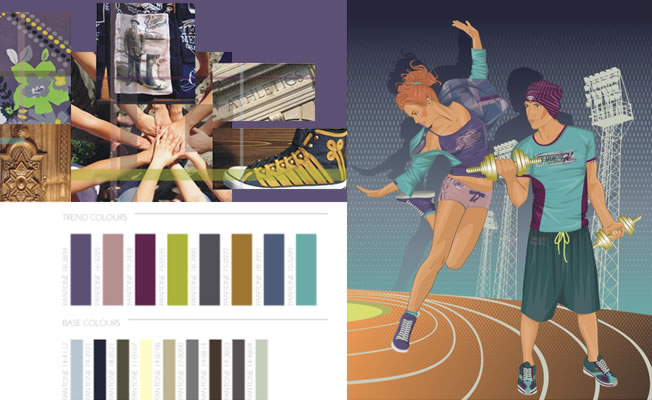 |
| SPRING / SUMMER 2012 ACTIVEWEAR: THE AGE OF COLLECTIVE CREATION Fiona Jenvey, CEO of global trend forecaster Mudpie, poses the question: "Who owns the future?" Answer: "All of us." Welcome to the new age of collective creation; never before has the consumer been considered so important, brands and corporations so accountable. As companies are pushed toward a much more transparent way of communicating their values, it suggests that the power increasingly sits with the consumer. A new philanthropic approach to business is being employed across the board, as profits become a luxury and breaking even a relief. For the Spring/Summer 2012 seasonal forecast, Mudpie explores the idea of 'Momentum' for the activewear market. In this forecast Mudpie reports that it is already seeing a major shift in consumer attitudes from the despondent to the enthused, particularly in the younger generations. Mudpie tells us that, as people across the globe realign their lives following the turbulence of recent years, the pace is gathering speed for a new lifestyle model that embodies a sustainable and collaborative future. For the Spring/Summer '12 season, Mudpie also explores a contemporary vision of multicultural Great Britain as it is propelled into the limelight in the 2012 London Olympics – a sure inspiration for sportswear and active trends. mudpie.co.uk |
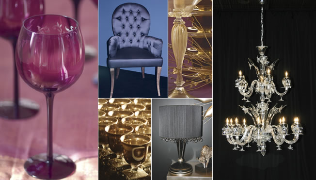 |
| CLASSY OVERTONES FOR THE HOME IN 2011 Elegance and sophistication are two words often used to define style. In this particular palette, Style and Substance, one of our 2011 forecasted palettes for the home, there is a blend of colors that succinctly gets that message across. Jet black and metallics of gold and silver are juxtaposed against subtle blue and frosted gray, while two substantive purples are flavored by the addition of a wine-ish brown, aptly named Chocolate Truffle. Style and Substance, a time-tested theme that speaks to our desire for fashion-ability and chromatic classicism, conveys an educated edge and is both poised and perfected. pantone.com/viewhome11
|
contact us | request catalog | forward to a friend | unsubscribe | privacy policy
This E-mail was sent to you by Pantone. To ensure delivery to your inbox (not bulk or junk folders), please add pantone@web.pantone.com to your address book.
This is an outbound E-mail only. We will be unable to respond to your reply.
© Pantone LLC, 2010. All rights reserved.
Pantone LLC, 590 Commerce Boulevard, Carlstadt, NJ 07072
PANTONE® and other Pantone trademarks are the property of Pantone LLC.
Pantone LLC is a wholly owned subsidiary of X-Rite, Incorporated.