Pantone Reveals Color of the Year for 2013:
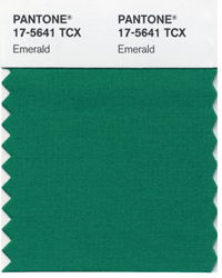
PANTONE 17-5641 Emerald
Radiant, jewel-toned Emerald promotes balance and harmony
CARLSTADT, N.J., Dec. 6, 2012 – Pantone LLC, an X-Rite company and the global authority on color and provider of professional color standards for the design industries, today announced PANTONE® 17-5641 Emerald, a lively, radiant, lush green, as the Color of the Year for 2013.
The 2012 Color of the Year, PANTONE 17-1463 Tangerine Tango, a spirited, reddish orange, provided the energy boost we needed to recharge and move forward. Emerald, a vivid, verdant green, enhances our sense of well-being further by inspiring insight, as well as promoting balance and harmony.
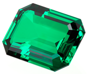 Most often associated with brilliant, precious gemstones, the perception of Emerald is sophisticated and luxurious. Since antiquity, this luminous, magnificent hue has been the color of beauty and new life in many cultures and religions. It’s also the color of growth, renewal and prosperity – no other color conveys regeneration more than green. For centuries, many countries have chosen green to represent healing and unity. Most often associated with brilliant, precious gemstones, the perception of Emerald is sophisticated and luxurious. Since antiquity, this luminous, magnificent hue has been the color of beauty and new life in many cultures and religions. It’s also the color of growth, renewal and prosperity – no other color conveys regeneration more than green. For centuries, many countries have chosen green to represent healing and unity.
 “Green is the most abundant hue in nature – the human eye sees more green than any other color in the spectrum,” said Leatrice Eiseman, executive director of the Pantone Color Institute®. “As it has throughout history, multifaceted Emerald continues to sparkle and fascinate. Symbolically, Emerald brings a sense of clarity, renewal and rejuvenation, which is so important in today’s complex world. This powerful and universally appealing tone translates easily to both fashion and home interiors.” “Green is the most abundant hue in nature – the human eye sees more green than any other color in the spectrum,” said Leatrice Eiseman, executive director of the Pantone Color Institute®. “As it has throughout history, multifaceted Emerald continues to sparkle and fascinate. Symbolically, Emerald brings a sense of clarity, renewal and rejuvenation, which is so important in today’s complex world. This powerful and universally appealing tone translates easily to both fashion and home interiors.”
Emerald for Fashion
The prevalence of green has been steadily rising for several seasons, especially in the fashion and couture markets, and even on the red carpet. Appropriate for every occasion, Emerald’s classic elegance makes for striking and irresistible women’s formal and everyday wear as well as accessories. Emerald also makes a strong statement in men’s sportswear, knitwear and ties. Fashion designers featured in the PANTONE Fashion Color Report Spring 2013, including Tracy Reese, Nanette Lepore, Barbara Tfank, NAHM and Marimekko, are incorporating Emerald into their spring collections. Balanced yet sophisticated, Emerald enlivens all colors in the spectrum and will continue to make a statement beyond spring and summer into fall and winter.
Emerald for Beauty
Equally harmonious on the cosmetic color wheel, Emerald dramatizes all eye colors as it beautifully enhances green eyes, is compatible to blue eyes, emphasizes the green undertone in hazel eyes and intensifies brown eyes to make them appear deeper. Emerald is also a perfect complement to peaches, pinks, roses, ruby reds and aubergines – offering a variety of lipstick and blush options. For those who want to sparkle and stand out, Emerald is the perfect punctuation point in nail color because of its complementary nature.
Emerald for Interiors
Enhance your sense of well-being at home by rejuvenating the interior with Emerald paint, accents and accessories. This jewel-like hue will create a luxurious feel in an entryway, powder room, dining room or study, and bring life to a living room as an accent wall. Add a splash of color to the kitchen and dining room areas with Emerald dinnerware, stemware and appliances.
Tollens inspired by Pantone
Pantone proudly announces its new partnership in the world of home decoration with the 260 years old paint brand Tollens®, a leader in the European paint industry. This partnership will give birth to an exclusive paint collection, Tollens inspired by Pantone, available throughout France in 2013.
Tollens inspired by Pantone paint collection is the new way to express the Pantone unique colour feeling in home decoration, with the highest paint quality for walls, wood and furniture. The partnership between Tollens and Pantone will take place in two steps: the launch of a 40-colours ready-mix paint collection in the Castorama DIY network in March, followed by the launch of a 100-shades colour collection in Tollens exclusive professional network in June. PANTONE 17-5641 Emerald will be the flagship colour in both collections.
“As a producer of high quality paint since 1748, Tollens was meant to meet Pantone, the world’s colour authority for nearly 50 years,” says Stephan Campion, managing director of Groupe Tollens. “This partnership creates a new expression of colour in home decoration, with a unique collection of beautiful colours in the best quality paint.”
Cross-Referencing to Other PANTONE Libraries
PANTONE 17-5641 Emerald can also be cross-referenced to all other PANTONE Libraries including PANTONE PLUS for graphic design. For cross-referencing information, see www.pantone.com/COY2013.
About the PANTONE Color of the Year
The Color of the Year selection is a very thoughtful process. To arrive at the selection, Pantone quite literally combs the world looking for color influences. This can include the entertainment industry and films that are in production, traveling art collections, hot new artists, popular travel destinations and other socio-economic conditions. Influences may also stem from technology, availability of new textures and effects that impact color, and even upcoming sports events that capture worldwide attention.
For more than a decade, Pantone’s Color of the Year has influenced product development and purchasing decisions in multiple industries, including fashion, home and industrial design, as well as product packaging and graphic design. Past colors include:
|
PANTONE 17-1463 Tangerine Tango (2012)
PANTONE 18-2120 Honeysuckle (2011)
PANTONE 15-5519 Turquoise (2010)
PANTONE 14-0848 Mimosa (2009)
PANTONE 18-3943 Blue Iris (2008)
PANTONE 19-1557 Chili Pepper (2007)
PANTONE 13-1106 Sand Dollar (2006)
|
PANTONE 15-5217 Blue Turquoise (2005)
PANTONE 17-1456 Tigerlily (2004)
PANTONE 14-4811 Aqua Sky (2003)
PANTONE 19-1664 True Red (2002)
PANTONE 17-2031 Fuchsia Rose (2001)
PANTONE 15-4020 Cerulean (2000)
|
About Pantone
Pantone LLC, a wholly owned subsidiary of X-Rite, Incorporated, has been the world's color authority for nearly 50 years, providing design professionals with products and services for the colorful exploration and expression of creativity. Always a source for color inspiration, Pantone also offers paint and designer-inspired products and services for consumers. More information is available at www.pantone.com. For the latest news, trends, information and conversations, connect with Pantone on Facebook, Twitter, Pinterest and Instagram.
About X-Rite
X-Rite, Incorporated, is the global leader in color science and technology. The company, which now includes color industry leader Pantone, develops, manufactures, markets and supports innovative color solutions through measurement systems, software, color standards and services. X-Rite's expertise in inspiring, selecting, measuring, formulating, communicating and matching color helps users get color right the first time and every time, which translates to better quality and reduced costs. X-Rite serves a range of industries, including printing, packaging, photography, graphic design, video, automotive, paints, plastics, textiles, dental and medical. For further information, please visit www.xrite.com.
PANTONE®…The color of ideasSM.
- # # # -
PANTONE® and other Pantone trademarks are the property of Pantone LLC. © 2012. All rights reserved.
|