|
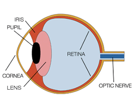
The human eye and brain together translate light into color. Light receptors within the eye transmit messages to the brain, which produces the familiar sensations of color.
Newton observed that color is not inherent in objects. Rather, the surface of an object reflects some colors and absorbs all the others. We perceive only the reflected colors.
Thus, red is not "in" an apple. The surface of the apple is reflecting the wavelengths we see as red and absorbing all the rest. An object appears white when it reflects all wavelengths and black when it absorbs them all.
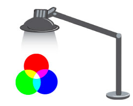 Red, green and blue are the additive primary colors of the color spectrum. Combining balanced amounts of red, green and blue lights also produces pure white. By varying the amount of red, green and blue light, all of the colors in the visible spectrum can be produced. Red, green and blue are the additive primary colors of the color spectrum. Combining balanced amounts of red, green and blue lights also produces pure white. By varying the amount of red, green and blue light, all of the colors in the visible spectrum can be produced.
Considered to be part of the brain itself, the retina is covered by millions of light-sensitive cells, some shaped like rods and some like cones. These receptors process the light into nerve impulses and pass them along to the cortex of the brain via the optic nerve.
Have you ever wondered why your peripheral vision is less sharp and colorful than your front-on vision? It's because of the rods and cones. Rods are most highly concentrated around the edge of the retina.There are over 120 million of them in each eye. Rods transmit mostly black and white information to the brain. As rods are more sensitive to dim light than cones, you lose most color vision in dusky light and your peripheral vision is less colorful. It is the rods that help your eyes adjust when you enter a darkened room.
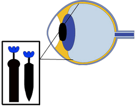 Cones are concentrated in the middle of the retina, with fewer on the periphery. Six million cones in each eye transmit the higher levels of light intensity that create the sensation of color and visual sharpness. There are three types of cone-shaped cells, each sensitive to the long, medium or short wavelengths of light. These cells, working in combination with connecting nerve cells, give the brain enough information to interpret and name colors. Cones are concentrated in the middle of the retina, with fewer on the periphery. Six million cones in each eye transmit the higher levels of light intensity that create the sensation of color and visual sharpness. There are three types of cone-shaped cells, each sensitive to the long, medium or short wavelengths of light. These cells, working in combination with connecting nerve cells, give the brain enough information to interpret and name colors.
The human eye can perceive more variations in warmer colors than cooler ones. This is because almost 2/3 of the cones process the longer light wavelengths (reds, oranges and yellows).
About 8% of men and 1% of women have some form of color impairment. Most people with color deficiencies aren't aware that the colors they perceive as identical appear different to other people. Most still perceive color, but certain colors are transmitted to the brain differently.
The most common impairment is red and green dichromatism which causes red and green to appear indistinguishable. Other impairments affect other color pairs. People with total color blindness are very rare.
Birds, fish and many other mammals perceive the full spectrum. Some insects, especially bees, can see ultraviolet colors invisible to the human eye. In fact, color camouflage, one of nature's favorite survival mechanisms, depends on the ability of the predator to distinguish colors. The predator is expected to be fooled by the color matching of the prey. Until recently, it was thought that dogs didn't see any color at all. Recent studies now show, however, that dogs can differentiate between red and blue and can even pick out subtle differences in shades of blue and violet.
More Color Education Articles:
|